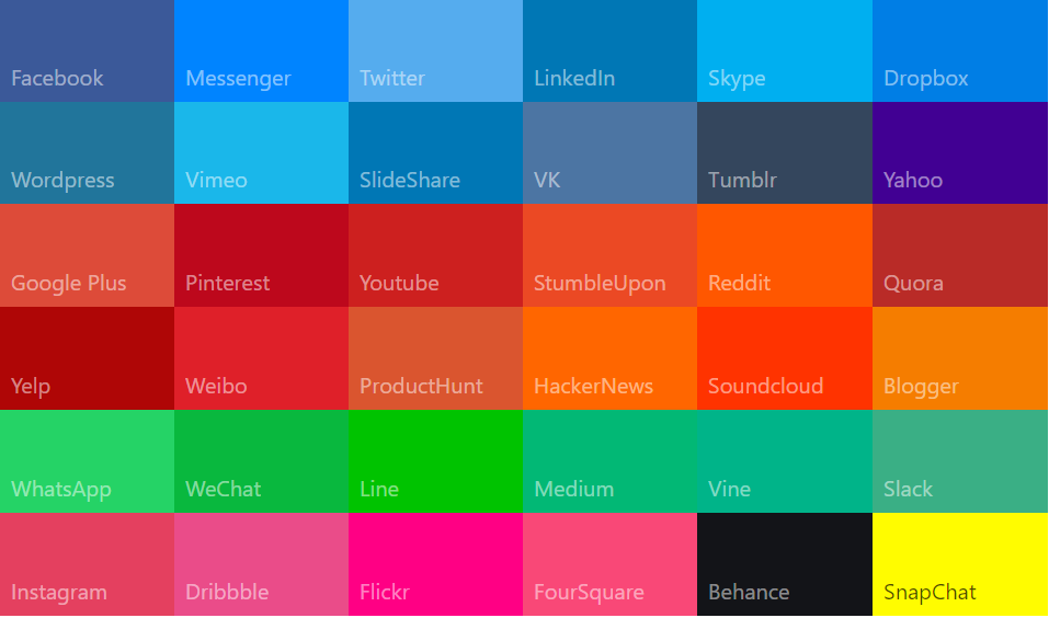
Website Color Psychology Secrets Revealed
Color usually depends on our own personal experiences and preferences but there are also some universal signals they portray. Choosing a color scheme sometimes can be a very challenging task. Personal preferences can vary based on gender, age and culture.
In a study titled “Impact of color on marketing,” researchers found that up to 90% of first impressions about products can be based on color alone. A study titled “Exciting red and competent blue” also confirms that purchasing intent is greatly affected by colors due to their effect on how a brand is perceived.
What does your brand say about your company?
If you’re creating a brand, use this guide to find the perfect colors for your company.
WHITE
Positive: Hygiene, sterility, clarity, purity, cleanness, simplicity, sophistication, efficiency.
Negative: Sterility, coldness, barriers, unfriendliness, elitism.
GREY
Positive: Psychological neutrality.
Negative: Lack of confidence, dampness, depression, hibernation, lack of energy.
BLACK
Positive: Sophistication, glamour, security, emotional safety, efficiency, substance.
Negative: Oppression, coldness, menace, heaviness.
YELLOW
Positive: Optimism, confidence, self-esteem, extraversion, emotional strength, friendliness, creativity.
Negative: Irrationality, fear, emotional fragility, depression, anxiety, suicide.
ORANGE
Positive: Physical comfort, food, warmth, security, sensuality, passion, abundance, fun.
Negative: Deprivation, frustration, frivolity, immaturity.
BROWN
Positive: Seriousness, warmth, Nature, earthiness, reliability, support.
Negative: Lack of humor, heaviness, lack of sophistication.
PINK
Positive: Physical tranquility, nurture, warmth, femininity, love, sexuality, survival of the species.
Negative: Inhibition, emotional claustrophobia, emasculation, physical weakness.
RED
Positive: Physical courage, strength, warmth, energy, basic survival, ‘fight or flight’, stimulation, masculinity, excitement.Negative: Defiance, aggression, visual impact, strain.
VIOLET
Positive: Spiritual awareness, containment, vision, luxury, authenticity, truth, quality.
Negative: Introversion, decadence, suppression, inferiority.
GREEN
Positive: Harmony, balance, refreshment, universal love, rest, restoration, reassurance, environmental awareness, equilibrium, peace.
Negative: Boredom, stagnation, blandness, enervation.
BLUE
Positive: Intelligence, communication, trust, efficiency, serenity, duty, logic, coolness, reflection, calm.
Negative: Coldness, aloofness, lack of emotion, unfriendliness.
Choosing an appropriate color combination in the design process is considered one of the most important (yet often overlooked) elements in creating a successful website.
**Quick tips**
- Focus on the target audience, not the colors you personally like
- Be mindful of the background color as well as the font color, they shouldn’t clash
- Color chooser tools can be very helpful
- Don’t use too many colors, usually 2–4 are enough
- Get some inspiration from looking at top websites in your industry
Did you enjoy this? If so, maybe you’d like to buy me a coffee?
You can do that here → paypal.me/ttgray
But if you can’t, that’s ok, too
It would be nice to subscribe to my youtube channel!


