4 Ridiculously Simple Ways To Improve Your Your Website’s Call-To-Action (CTA)
Dramatically improve your website’s conversion rates.
To increase the number of leads your website generates, you need a very strong call-to-action (CTA). A small “click here” button randomly place on a page might get lost. It can take some time to analyze and configure the right layout of your pages but improving your CTA doesn’t have to be difficult. By incorporating the following features into your website’s CTA, you can dramatically improve your website leads.
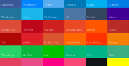
Colors that POP
Us humans are visual creatures. The more your CTA stands out, the more users are likely to click on it. Be sure that your button contrasts sharply with the rest of your website.
If your page is mostly a light color, try a red or a green CTA button. Don’t be afraid to use ‘warning’ colors such as red or orange. A CTA is no good if users don’t see it.
Action provoking words
Use words that trigger strong emotional reactions. The trick is to keep it simple while inspiring action. Powerful CTA’s include:
- Yes, Sign me up!
- Get access now
- Get a free quote
- Find out how
- Learn today
- Get started now
Whatever terms you choose, make sure that it is clear what the end result will be of clicking the button.
Make it BIG
You want your CTA to stand out immediately. To do this, make your button bigger than the rest of the elements on your landing page. It should be big enough to be noticed and big enough to be tapped easily if users are on their mobile devices.
LOCATION. LOCATION. LOCATION.
The location of your button mostly depends on your web page layout. You want to put it where the user doesn’t need to scroll. A good spot would be in the top banner itself or in the first part of the content directly below the banner. If you are using a floating button that stays on the screen as you scroll,. it might be okay to put it in the bottom corner.
Try this out: open up a few websites and see the first place your eyes go. Don’t put the CTA in a place your eyes would not normally be drawn to. As with every element we discuss here, don’t be afraid to test different locations to find the best placement. This is called A/B Testing, but that’s a topic is for another day!
These specific features can dramatically improve the attention your CTA receives. Keep this in mind, and you will be well on your way to increasing your conversion rate.
If you need help with your website’s CTA, please give me a call at 724-493-0077.


