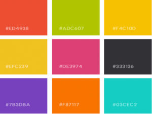
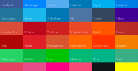
If you have the latest Windows software or the new iOS operating system, you’re seeing this new trend in web design every time you use your mobile device: flat color.
 Flat color, a move away from the previous trend of gradients, drop shadows, and 3D style graphic design, is a simplified way of designing your website. This user-friendly trend shows a shift in the design world towards minimalism.
What is Flat Color?
Essentially, flat color is simple. It exists only in 2D, and it does not involve any 3D elements such as textures, bevels, and shadows. Flat color has much fewer gradients than other color schemes, and it uses a lot of straight lines and square corners. In addition, flat design focuses on typography and makes use of interesting, unique color combinations and variations.
Why Flat Color?
What has caused this shift from textures and gradients to flat color design? The reason why users like flat color is because it creates simplicity.
Examples of Flat Color Sites
Many major companies, brands, and designers are following this trend and re-creating their websites using flat color. One example of a top brand using flat color is Microsoft Windows. While Microsoft struggles to compete with Apple, a brand often viewed as more hip and fun, the use of flat color beginning with Windows 8 was a major success.


